Adero
How do you help reboot a next generation product, starting from scratch?
Adero is a technology solution to help organize your life through the use of a mobile app and smart tags. In 2019, it was named “Top 10 most innovative consumer hardware company” by Fast Company.
While at Cibo, I led our team, working closely with the Adero marketing team, to develop their new brand identity and design system across their physical and digital experiences. We also worked closely with their product design team to ensure every aspect of the brand strategy and narrative was consistent across all channels.
The final concept for the Adero logo centers around “Always Together” and being connected to all your things at any moment of the day. With Adero, you're able to take control of how you organize your everyday life and gain back time. Our performance campaigns and package design draws on the outcome of being connected to your things through emotional lifestyle photography.
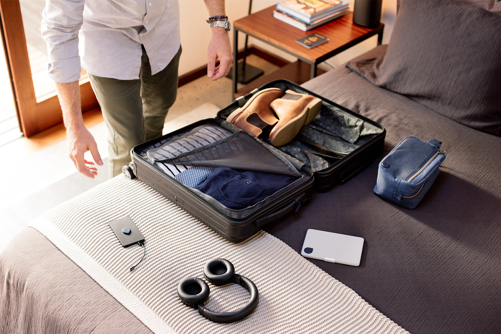
From our personas and research, we visualized a series of “life progressional stories” to help provide context for how Adero applies to your daily life—as a teenager to adult, casual to professional. In our design system, the circle becomes the universal platform to tell a range of customer stories.
Team: Michael Conti, Nate Sprecher
Product design: Fjord

Extensive explorations for the Adero logo, taking into consideration early on how it would have to adapt to many different applications.


As part of the brand voice, we didn’t rely on technology lingo to educate the customer. Instead, we humanized the story through conversational tone and giving our product a sense of purpose.

The Adero logo helped to inform the UI design language for the mobile app and provided a framework for intuitive navigation and to easily find your things. A key design principle was “accessible,” which applied to the look, behavior, and tone of the brand.
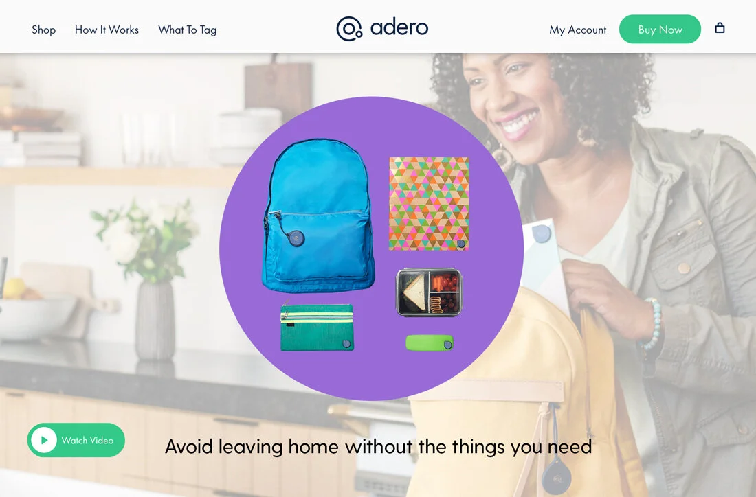
We visualized a series of “life organization stories” as part of our design system to help customers quickly understand how Adero applies to their daily lives—as a teenager or adult, casual or professional. These stories extended into many different executions.


Intelligent Organization
Short introduction videos to promote the Adero organization solution. The circle becomes a macro view of life organizing stories to quickly help our customers understand the value of our product.